Weirdos Cereal

Weirdos Cereal

Weirdos Cereal

Weirdos Cereal

The Weirdos cereal rebrand is a creative mock-up aimed at reimagining the beloved Cheros brand with a fresh, quirky twist. The goal was to modernize the look of a traditional, nostalgic cereal while incorporating elements of fun, inclusivity, and health-consciousness, all while keeping the core essence of the original product. This conceptual rebrand explored how bold design choices and a fun, offbeat identity could reposition Cheros as a cereal that appeals to a wide range of audiences, from children to health-conscious adults.

Branding
Client
kellogg's
CAtegory
Branding
Product Duration
2 weeks
Designing

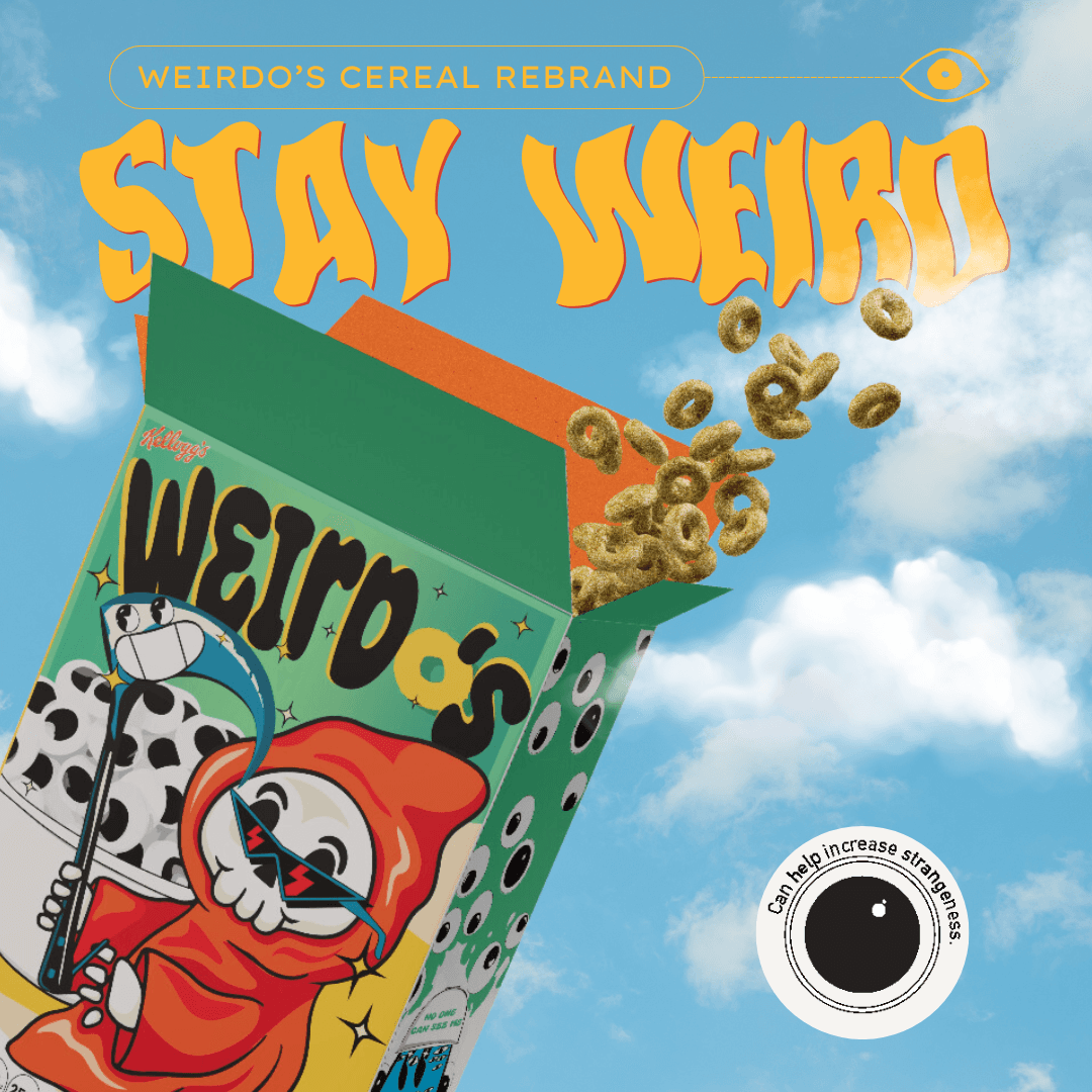
The design for Weirdos embraces eccentricity and self-expression. The packaging is full of vibrant, attention-grabbing colors like neon green, electric blue, and hot pink, with quirky illustrations of unique characters. These characters, each with a different style and background, represent the concept of embracing "weirdness" as a positive, empowering trait. The playful and somewhat chaotic design language gives off a sense of adventure and individuality, suggesting that there’s no "one way" to enjoy breakfast.

In terms of typography, the bold, graffiti-inspired fonts paired with clean sans-serif text give the packaging a contemporary, youthful feel. The playful yet minimalistic visual elements were designed to break away from the overly commercial designs of typical cereals.

Development

This mock-up rebrand required careful thought about how to balance fun and health-consciousness. The cereal’s nutritional information was clearly outlined with a focus on lower sugar content, whole grains, and plant-based ingredients. To appeal to a more health-savvy audience, the box highlighted these features through simple, colorful icons that instantly communicated the product’s benefits.

The back of the box featured a playful, interactive design with fun facts, challenges, and ways for kids and adults to get creative with their cereal. This playful interactivity helped emphasize the concept of being a "Weirdo" in the best way possible—through curiosity and exploration.

Mobile Screenshot
Mobile Screenshot
Mobile Screenshot
Mobile Screenshot
Mobile Screenshot
Mobile Screenshot
Problems

The original Cherios branding was dated, often associated with overly sugary products that no longer aligned with current health trends. It also lacked a strong identity that could resonate with today’s diverse, individuality-driven consumer base. The challenge was to reimagine the brand in a way that would break away from its sugar-heavy past while still retaining the nostalgic connection fans had with it.

The original Cherios branding was dated, often associated with overly sugary products that no longer aligned with current health trends. It also lacked a strong identity that could resonate with today’s diverse, individuality-driven consumer base. The challenge was to reimagine the brand in a way that would break away from its sugar-heavy past while still retaining the nostalgic connection fans had with it.

The original Cherios branding was dated, often associated with overly sugary products that no longer aligned with current health trends. It also lacked a strong identity that could resonate with today’s diverse, individuality-driven consumer base. The challenge was to reimagine the brand in a way that would break away from its sugar-heavy past while still retaining the nostalgic connection fans had with it.

Tab Screenshot
Tab Screenshot
Tab Screenshot
Solutions


The Weirdos rebrand takes a bold approach, positioning the cereal as an exciting, healthy, and inclusive option. The name Weirdos was chosen to evoke an empowering, positive message about embracing what makes each individual unique. The design cleverly blends a playful, edgy look with a health-conscious message by using modern typography, vibrant colors, and symbols of individuality. This new brand voice and image make the cereal feel fresh and exciting, while still maintaining the playful spirit that fans loved.

In terms of health messaging, the mock-up emphasized the key features such as whole grains, lower sugar, and plant-based ingredients, making it clear that Weirdos could be both fun and healthy.


Results

Although this rebrand is a mock-up, the concept behind Weirdos was well-received. The design successfully communicates the idea of breaking free from traditional, overly commercialized cereal brands, presenting a fresh, fun approach. Feedback from focus groups (hypothetical in this case) indicated that Weirdos resonated with a younger, more health-conscious demographic who sought both nostalgia and novelty in their cereal choices. Additionally, the fun and inclusive branding sparked discussions on social media, with consumers imagining themselves as part of the Weirdos community.

Though it was only a mock-up, this rebrand illustrated the potential to modernize a classic product in a way that appeals to evolving consumer tastes. The Weirdos concept captured attention for its unique twist, fun personality, and balance of health and playfulness, proving that even a beloved cereal can evolve into something fresh and exciting.

ALSO VIEW MORE WORKS
ALSO VIEW
MORE WORKS
ALSO VIEW MORE WORKS
BG
Say hi, I like it when people say hi

GOT NEW

IDEAS
IDEAS

?

I LOVE

IDEAS
IDEAS

.

©wulf in sheeps coding 2024
BG
Memoji
BG
Say hi, I like it when people say hi

GOT NEW

IDEAS
IDEAS

?

I LOVE

IDEAS
IDEAS

.

©wulf in sheeps coding 2024
BG
Memoji
BG
Say hi, I like it when people say hi

GOT NEW

IDEAS
IDEAS

?

I LOVE

IDEAS
IDEAS

.

©wulf in sheeps coding 2024
BG
Memoji